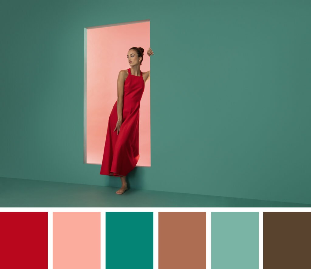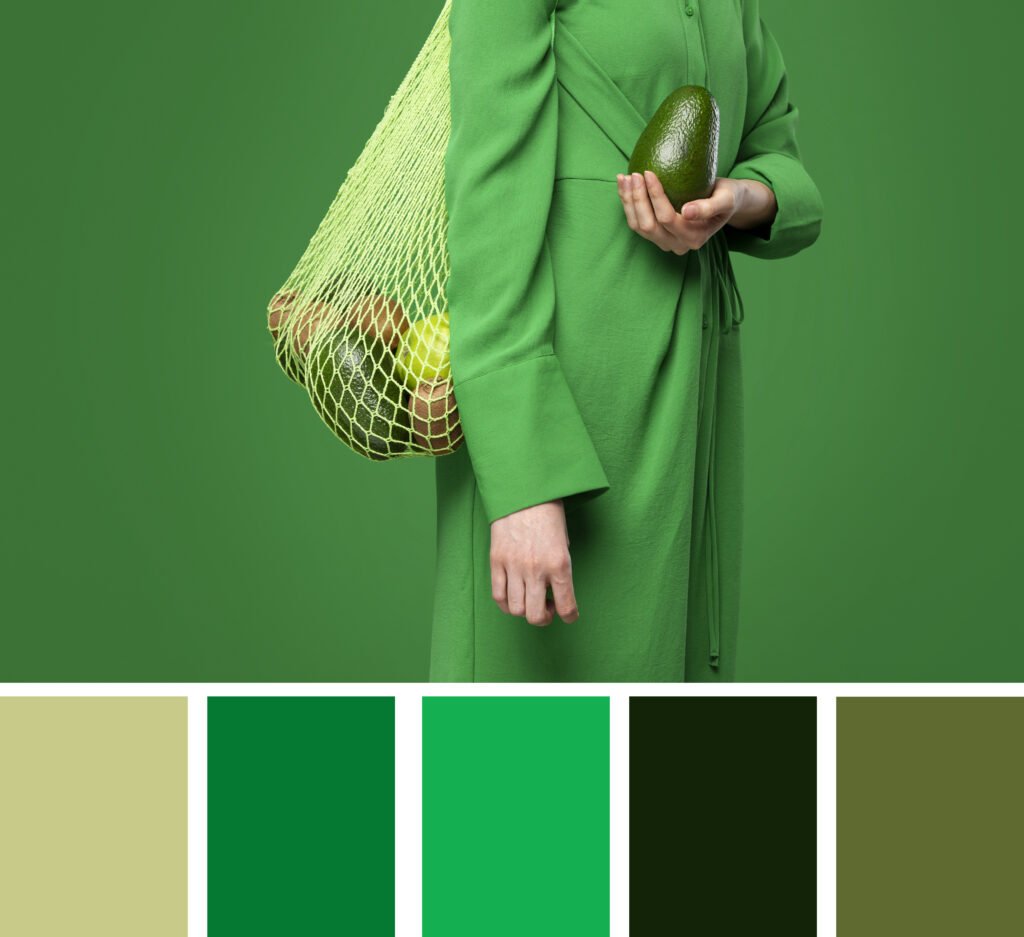
Color plays a powerful role in our lives. Whether we realize it or not, the combinations we choose influence mood, perception, and the overall aesthetic of everything from our wardrobe to our home décor, websites, and branding. While personal style and trends can influence color preferences, there are some color combinations that always work—regardless of the season, design medium, or fashion fad.
In this blog, we’ll explore tried-and-true color pairings that have stood the test of time. These classic combos are perfect for anyone—from interior designers and graphic artists to fashion lovers and business owners—looking to make confident, visually-appealing choices.
1. Black and White – The Eternal Classic
You can always count on black and white to deliver impact. This bold, high-contrast duo remains a staple for its crisp, refined, and effortlessly timeless appeal.
Why it works:
Black and white provide a perfect balance of contrast and harmony. The lack of color forces attention on form, structure, and content, making this combination ideal for minimalist designs, typography, and formal fashion.
Where to use this color combinations
- Graphic design and branding
- Office or modern home interiors
- Elegant evening wear or formal events
Pro tip: Add a splash of gold, red, or emerald for an extra touch of luxury or warmth.
2. Navy and Gold – Rich and Regal
This combination exudes elegance, professionalism, and a hint of royalty. Navy offers depth and calmness, while gold adds warmth and luxury.
Why it works:
Navy is a dark neutral that can ground brighter colors like gold. When paired together, they create a sense of timeless prestige without being overpowering.
Where to use it:
- Wedding décor and invitations
- Corporate branding
- Luxe home interiors and accessories
Pro tip: Try matte gold against matte navy for a modern twist.
Blush Pink and Grey – Delicate Meets Contemporary
Blush pink, with its gentle warmth and pastel charm, finds a perfect companion in the understated coolness of grey. Together, they create a serene, stylish palette that feels both tender and refined. This combination radiates calm sophistication—ideal for settings where softness and elegance are key.
Why it works:
Grey provides a cool, neutral base that balances the warm, feminine vibe of blush pink. Together, they evoke feelings of serenity and romance.
Where to use it:
- Bedroom or nursery décor
- Feminine brand identities
- Spring fashion and weddings
Pro tip: Use darker greys for a more dramatic contrast or pale greys for a light, airy look.
4. Earth Tones – Nature’s Palette

Natural hues like olive green, terracotta, beige, and rust have a lasting charm that transcends trends.
Why it works:
Earth tones are inherently balanced and comforting. Because they occur in nature, the human eye finds them pleasing and easy to harmonize with.
Where to use it:
- Boho home décor
- Sustainable fashion branding
- Outdoor product packaging
Pro tip: Combine earthy tones with natural textures like wood, linen, or leather for a rustic and organic feel.
5. Turquoise and Coral – Vibrant and Tropical
This pairing is bright, playful, and perfect for creating an energetic vibe. Turquoise brings a refreshing, oceanic coolness, while coral adds a warm, sun-kissed contrast.
Why it works:
These colors sit opposite each other on the color wheel, making them complementary. Their balance of warm and cool creates visual interest without clashing.
Where to use it:
- Summer event themes
- Beachwear or resort branding
- Kids’ products and playful packaging
Pro tip: Use these colors in moderation for a chic look; too much can become overwhelming.
6. Charcoal and Mustard – Bold and Contemporary
Charcoal grey and mustard yellow make a modern and stylish combo that feels both edgy and inviting.
Why it works:
Charcoal acts as a strong, stable base, while mustard offers a pop of bold, retro-inspired color. The contrast is striking yet balanced.
Where to use it:
- Mid-century modern home décor
- Urban fashion collections
- Modern tech branding
Pro tip: Add white or light wood accents to soften the contrast and add depth.
7. Cobalt Blue and White – Crisp and Clean
Cobalt blue, with its rich intensity, paired with clean white creates a classic Mediterranean-inspired palette.
Why it works:
The brightness of cobalt draws the eye, while white provides balance and space, making this combination ideal for fresh, lively designs.
Where to use it:
- Kitchen or bathroom interiors
- Nautical fashion or beach branding
- Summer events or promotional materials
Pro tip: Add metallics like silver for a refined touch or use terracotta as an accent for warmth.
8. Beige and Forest Green – Calming and Grounded
This nature-inspired pairing brings tranquility and richness. Beige, with its warm neutrality, complements the deep, earthy tones of forest green beautifully.
Why it works:
Forest green represents renewal and stability, while beige keeps things simple and grounded. Together, they create a luxurious but relaxed look.
Where to use it:
- Interior design (especially living rooms or offices)
- Skincare or eco-friendly product branding
- Autumn or outdoor fashion collections
Pro tip: Add copper or brass accents to enhance the natural aesthetic.
9. Teal and Burnt Orange – Energetic and Balanced
This pairing bursts with energy, character, and a playful sense of style. Teal brings a sophisticated coolness, while burnt orange adds warmth and vibrance.
Why it works:
Teal and burnt orange strike a bold visual balance, their placement on opposite ends of the color wheel creating a vibrant and energizing contrast.
Where to use it:
- Retro-inspired graphic design
- Fall fashion and accessories
- Event themes for creatives and artists
Pro tip: Use neutral tones (like cream or light grey) as a backdrop to prevent these colors from overwhelming the space.
10. Cream and Dusty Blue – Subtle and Elegant
Soft, romantic, and easy on the eyes, cream and dusty blue are perfect for creating a timeless, airy aesthetic.
Why it works:
Dusty blue has just enough color to make a statement, while cream adds warmth without the starkness of white. Together, they’re understated and sophisticated.
Where to use it:
- Wedding color palettes
- Vintage or romantic branding
- Bedroom interiors or feminine workspaces
Pro tip: Add touches of rose gold or greenery for an extra romantic feel.
Why These color Combinations Work
The effectiveness of these color pairings often boils down to three key principles:
- Contrast – Opposite or varying tones add interest and draw the eye.
- Balance – Mixing warm and cool tones, or neutral and saturated hues, creates harmony.
- Mood – Colors evoke emotions. The right combination helps tell a visual story or convey a brand message.
Understanding these principles empowers you to not only use the classics but also experiment with confidence.
Final Thoughts
Great color combinations are about more than just aesthetics—they influence how people feel, how they engage, and how memorable something becomes. While trends come and go, the ten color combinations we’ve explored above have enduring appeal that transcends time and style.
Whether you’re refreshing a room, designing a logo, creating social media content, or simply putting together an outfit, these palettes offer a reliable foundation to build from. So, the next time you’re stuck in a creative rut or overwhelmed by options, return to these timeless pairings—they won’t let you down.